← All case studies
Presentation Redesign
From Campaign Documentation To Strategic Analysis
Revisiting an old presentation through the lens of strategic thinking.
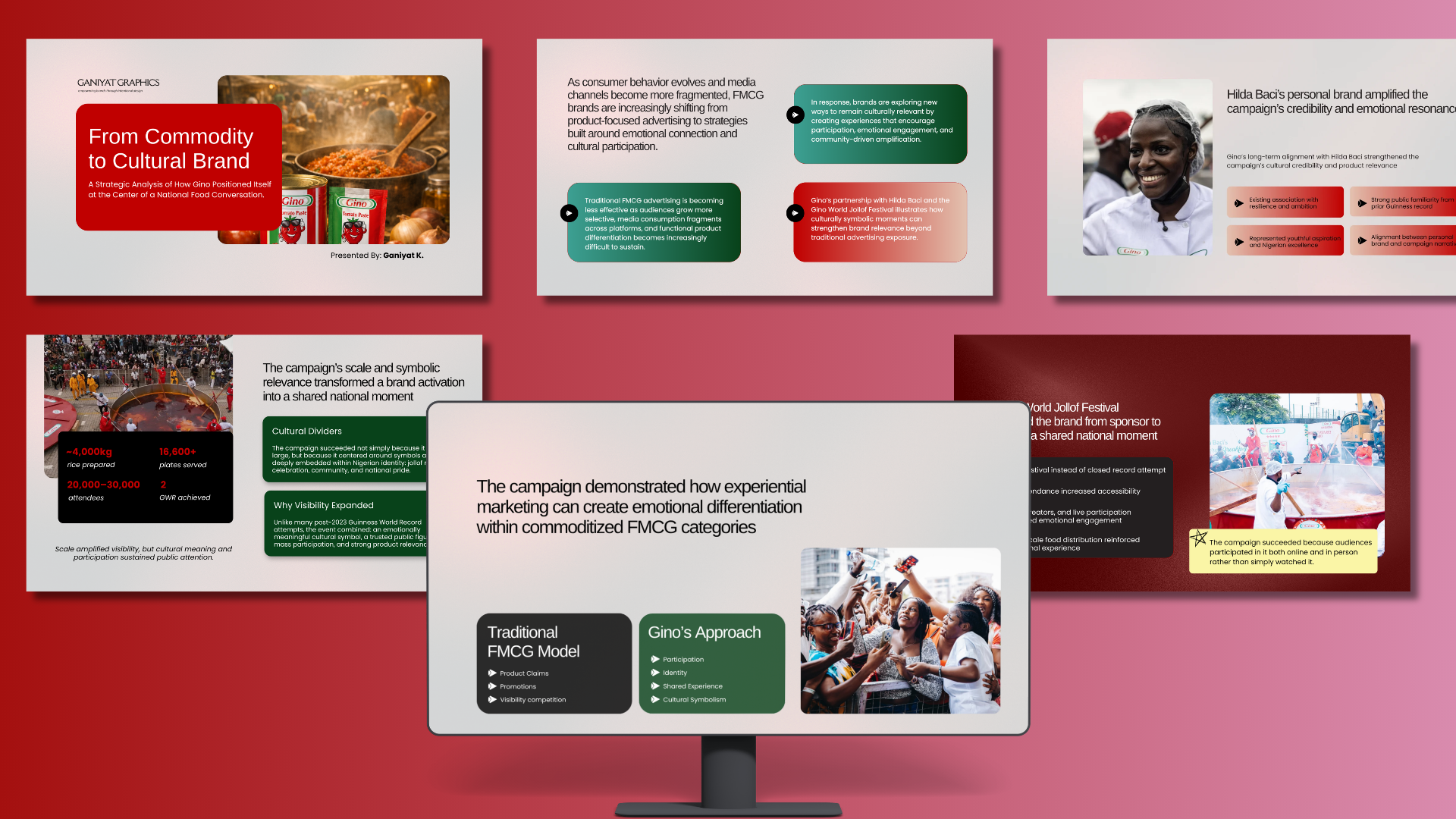 Cover slide — placeholder
As a self-taught presentation designer, every project I work on changes how I see the next one. I used what I'd learned from recent client work to revisit an older presentation I'd created around the Gino World Jollof Day campaign.
When the event was gaining attention across Nigeria, I created a presentation documenting the campaign, its scale and the cultural moment around it. The goal was to turn a real-world event into engaging content for social media.
It was imagery-led and animated, designed to capture attention and tell the story visually.
It did what I had intended.
Almost a year later, I wasn't sure it was enough.
Revisiting the Work
By then, I wanted to explore a different style of presentation writing. I was paying more attention to information structure, narrative flow and the role every slide plays in making an argument, while studying McKinsey-style presentation writing, particularly the use of action titles that communicate an insight rather than simply label a topic. So I returned to the Gino presentation and reworked the original content around a clearer strategic narrative and stronger headlines. The result was more analytical, but visually, I had kept much of the editorial, imagery-led approach from the original. And that raised a question: Was the visual approach actually working against the story and intended audience? My first instinct was to say yes.What Was I Optimizing For?
I considered taking the presentation in a much more chart- and data-led direction. If I was trying to create an analytical presentation, perhaps I needed to remove the imagery and adopt a more conventional consulting visual language. But before changing the design, I stepped back and asked a more important question: What am I actually designing for? Looking at the content again, I observed that this wasn't a brand reporting on its own campaign but an external analysis of it — examining what FMCG brands could learn from the way Gino participated in a culturally significant moment. With that distinction, the imagery wasn't inherently the problem. The question was rather whether each visual was helping communicate the argument.Reframing the Story
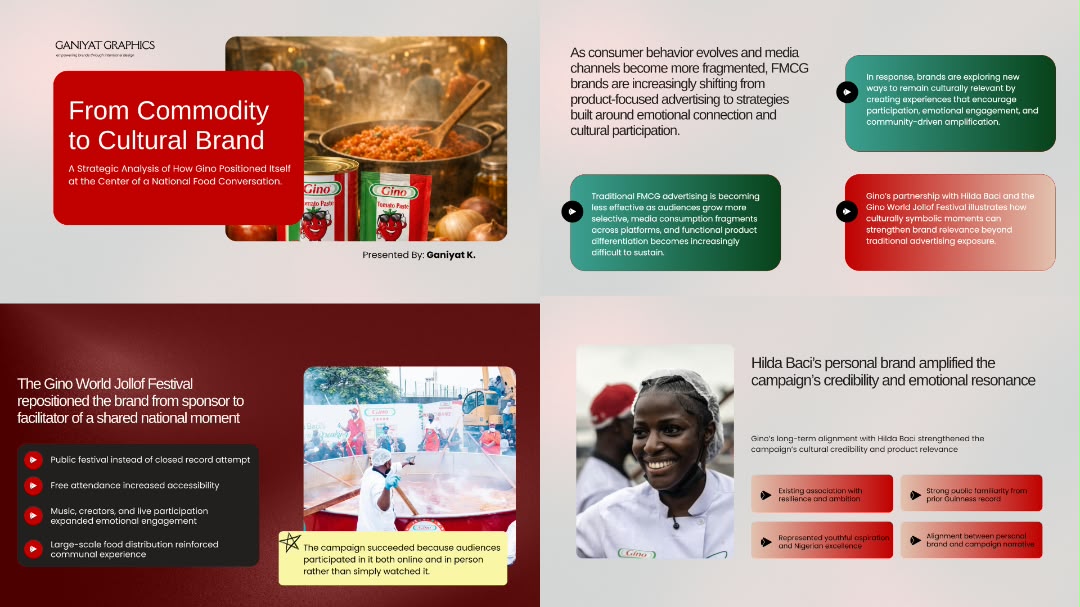
With that perspective, the presentation became less about documenting what happened and more about understanding why the campaign mattered. The story centred on the combination of elements that gave Gino a meaningful role in the cultural moment:- -a culturally symbolic product: jollof rice
- -a trusted public figure: Hilda Baci
- -mass participation
- -and a natural connection between the brand and the experience
Design Approach
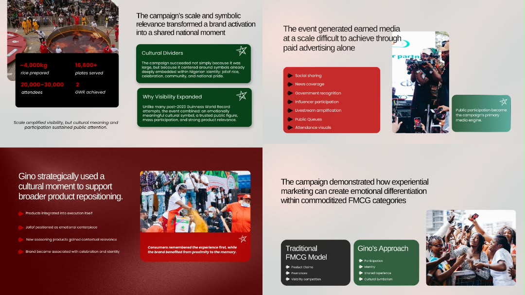
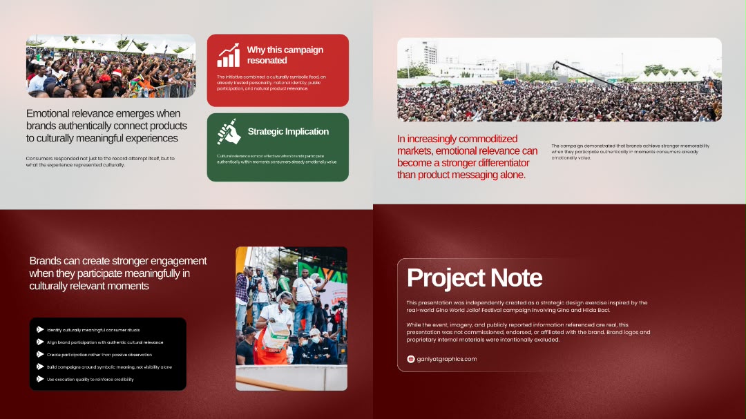
The visual system combines McKinsey-inspired communication principles with a warmer editorial visual language. Structure Action titles communicate the insight of each slide, creating a narrative that can be understood quickly while skimming the presentation. Layout A modular card-based system that gives imagery, statistics and analytical content defined spaces – working well together. Imagery Images are selected according to the claim they help communicate, preserving the documentary quality of the original concept while giving the visuals a clearer purpose. Color Gino's red anchors the palette, supported by maroon, dark green, cream and black. The restrained system maintains the brand connection while keeping the presentation feeling analytical rather than promotional.The Lesson
The biggest lesson from revisiting this presentation wasn't about making it look more like a McKinsey presentation but about tailoring slides content to an audience before designing the solution. I had initially treated “McKinsey-style” as a visual reference — action titles, restrained layouts, charts and white space. But those aren't the strategy. They're consequences of the strategy. The more important decisions came first: Who is speaking? Who are they speaking to? What are they trying to communicate? And what role should design play in making that argument clear? Once I understood the presentation's perspective and purpose, the visual decisions became much easier to make.Image Selection
Imagery was sourced primarily from real photographs and publicly reported coverage of the event to preserve the authenticity and documentary quality of the presentation. The cover is the only AI-generated visual, created using Microsoft Copilot and ChatGPT to establish a stronger cinematic opening.Project Note
This presentation was independently created as a strategic design exercise inspired by the real-world Gino World Jollof Festival campaign involving Gino and Hilda Baci. The event, imagery and publicly reported information referenced are real. This presentation was not commissioned, endorsed or affiliated with Gino or Hilda Baci. Brand logos and proprietary internal materials were intentionally excluded.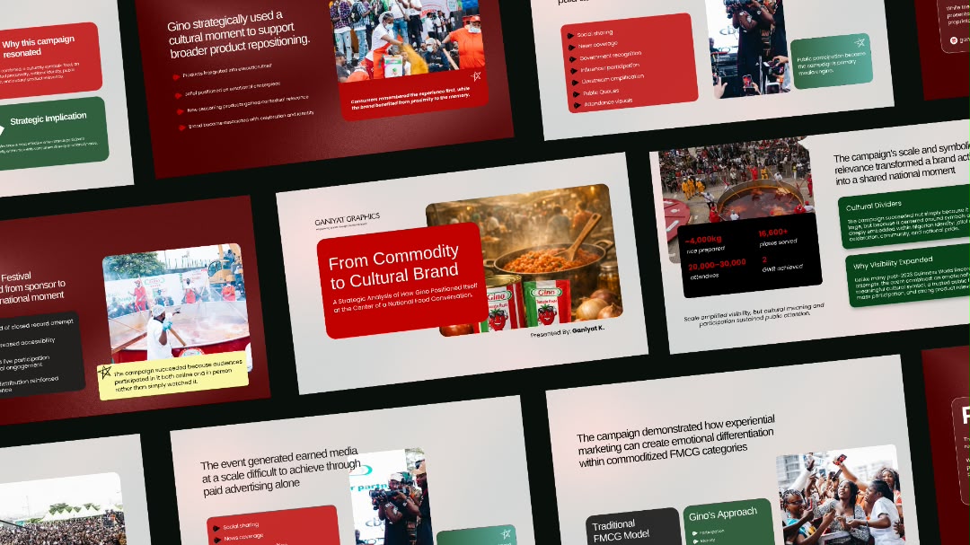 Slide — data
 Slide — roadmap
 Slide — gallery
 Slide — statement