The Brief
Northbridge Insights is a B2B market intelligence and consulting firm helping companies make better decisions around market expansion and business performance.
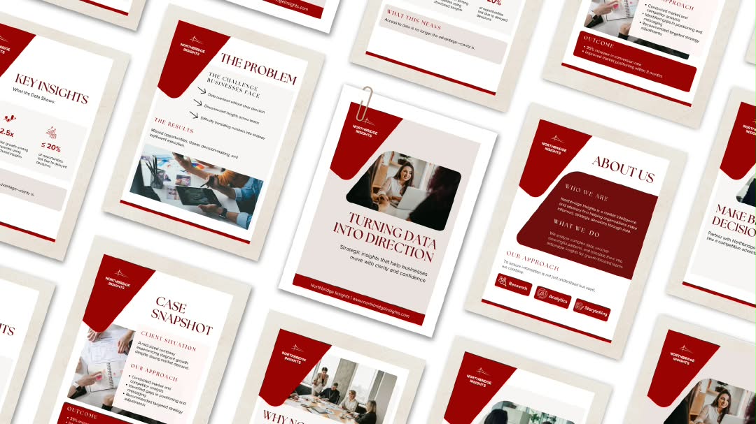
The brief called for a brochure that could communicate research and insights to business decision-makers without making the information feel overwhelming.
The challenge wasn't a lack of information but too much of it.
The source content was dense, factual and heavily information-driven, with limited narrative flow between sections.
The design therefore needed to do more than make the document look polished. It needed to help the reader understand what matters, why it matters and what to do next.
The Approach
I treated the brochure as a communication problem before treating it as a layout exercise.
The first step was to identify the hierarchy within the content: the key insights, supporting evidence and information that could be condensed or given less visual weight.
From there, I structured the brochure around a clearer progression, allowing each section to answer a specific question rather than presenting the research as one continuous block of information.
Key findings were given greater visual prominence, while supporting information was intentionally reduced in emphasis.
Making the Information Easier to Navigate
Because the audience is made up of business decision-makers, the brochure needed to support quick scanning as well as deeper reading.
The layout uses clear section breaks, strong typographic hierarchy and varied content blocks to create visual pauses throughout the document.
Rather than giving every piece of information equal weight, the design creates a clear distinction between:
The insight → The evidence → The implication
This gives the reader multiple entry points into the content and makes a research-heavy document feel more approachable.
Visual Direction
The visual system was deliberately clean and corporate, with minimal but intentional use of colour.
Typography does most of the work in establishing hierarchy, while structured layouts create consistency across the document.
Charts, statistics and supporting visuals are given enough space to be understood without competing with the surrounding content.
The result is a brochure that feels credible and professional without relying on excessive decoration to communicate expertise.
The Result
The final concept transforms a dense collection of market intelligence into a more structured editorial experience.
Instead of asking the reader to work through the research to find the important points, the design establishes a visual path through the information — making key insights easier to identify, understand and act on.
The project demonstrates how document design can function as information architecture, not simply visual styling.
Project Note
Northbridge Insights is a conceptual brand created for this portfolio project.
This brochure was developed as a self-initiated design exercise inspired by an Upwork project brief. The company, content and visual identity are fictional and were created solely to demonstrate my approach to designing B2B research and consulting materials.
 Cover slide — placeholder